
The branding manager
Welcome to my design department!
So that your videos don't look “off the shelf”, but unmistakably your real estate brand, I need to know who you are.
The brilliant thing about it: You have to only once Set it up here. Then I have an elephant memory and apply your logo, colors and fonts automatically each new video on. That saves you a lot of time!
Here I'll show you how we can perfectly style your company profile.
1. The magic quick start: automatic recognition
You don't want to search out hex codes for colors? No problem! I'm a little detective.
- At the top, just enter your web page URL one (e.g. https://deine-website.de).
- Click on “Recognize branding”.
- I scan your page and automatically draw your logo and main colors
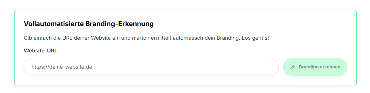
Do you like what I've found? Great! Just click 'Accept suggestions'so that I can save the data directly. If it doesn't quite fit yet: No stress! You can manually adjust every detail below.”

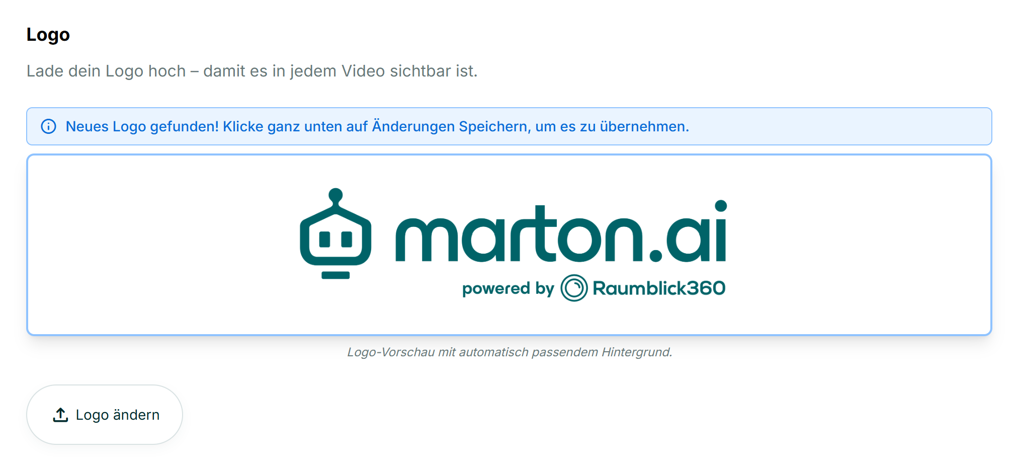
2. Your company logo
I need your logo so that every viewer immediately knows who the professional behind the object is.
- Automatically: Did you use automatic recognition above? Then your logo should already shine here!
- Manually: Is the field still empty or did I get the wrong picture? No problem! Just click “Change logo” and manually upload your file.
- The result: I will place your logo clearly visible in Outro at the end of every video. If you want, I'll also show it in intro right at the beginning — simply choose a suitable intro template later.
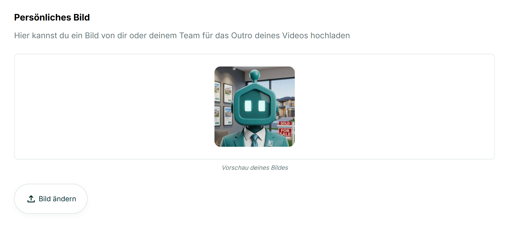
3. Your personal profile picture
Real estate is a matter of trust. That's why I'm showing in Outro (the credits) like to face the name.
- Please upload manually: Since I don't know exactly who is sitting in front of the screen, I can't drag this image from the website. Click on “Change image” and simply upload a nice photo of thee high.
- The choice is yours: Don't worry, I won't just stick the picture all over it. It only appears if you later actively opt for an outro template that has space for a profile picture (such as “outro with contact card”). So you can make a new decision for every video: With a face or without?
4. Your brand colors
Now it's getting colorful! Here we define the look of the text overlays.
Automatic vs. manual:
- Did I get your colors above through the automatic recognition Have you already found them and have you taken them over? Perfect! Then the fields here have already been filled out.
- If not (or if I was wrong), you can simply manually set or correct your brand colors here.
The color settings:
- Primary & secondary color: These are usually the colors from your logo.
- Text colors: Make sure the contrast is good here! Light font on a dark background (or vice versa) is best read.
- Background colors: Some outro templates use full color as a background instead of letting the video shine through.
- Marton's clear recommendation: Here I strongly advise you to white (#ffffff).
- Why A white background looks the most serious, clean and is not distracting. In addition, your logo almost always looks best on white. Less is definitely more here!
5. Writing & Shapes (The Fine-Tuning)
So that your video looks professional down to the last detail and fits your brand perfectly, we'll take care of the subtleties here.
font:
Your trained eye is needed here! Select the font that best suits your style from my list.
- Tip: Choose a font that is similar to the one on your website or in your exposés (such as “Inter” for modern looks, or a classic font for elegance).
Degree of rounding (corners):
How round should the buttons and text boxes be in the video?
- The highlight: I tried this value from your website to take over automatically (if you used the recognition above). However, you can adjust it at any time.
- Marton's design tip: Follow your website or corporate design (CI)!
- Are your buttons and boxes on the homepage more likely square and edged? Then move the slider to the left (direction 0px).
- Is everything soft on your side and rounded? Then move it to the right (e.g. 24px).
- In the end, your video looks like it was in one piece with the rest of your appearance!
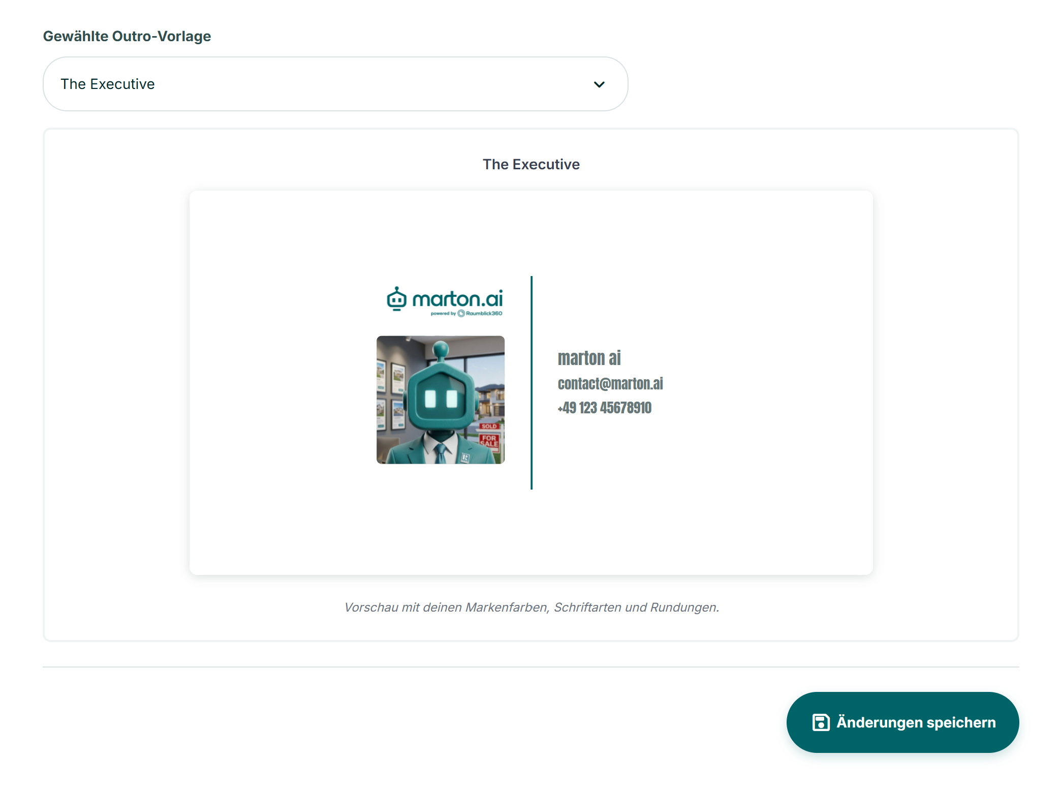
6. Select intro & outro templates
What should the start and end of your video look like?
Select yours here default template (for example, “The Eclipse” or “The Fine Line”).
- Live preview: The cool thing is that you can immediately see how your logo, colors, and chosen template look together at the bottom. Click through until it's perfect!
- Don't worry, you're not making up your mind:
The template you choose here is just your “standard outfit” so that it's faster later on. But you can later at every single video Spontaneously choose a completely different template when you need a change of pace. - And the lyrics?
The texts that you see in the preview here (such as headline, highlights or price) are only Placeholder examples. You will later enter the real information about the property individually and freshly for each property.
7. IMPORTANT: Don't forget to save!
Are you happy with your look? Then scroll all the way down and click on the dark green button “Save changes”.
Only then will I remember your settings for the future.
⚠️ Attention:
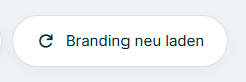
If you just whilst If you change something here during a video creation, it does not automatically have an immediate effect on the open project.
Go back to your video and click on the “Video overlays” step “Reload branding”. Then I'll go for your fresh design right away!
Have fun designing!